Article and all photos by Joe Mock, BaseballParks.com
All rights reserved
Clippers’ new home is our 2009 Ballpark of the Year
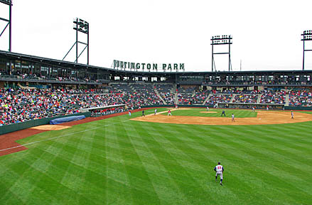 |
So there I was exploring one-day-old Huntington Park with Scott Ralston and Chris King of 360 Architecture, designers of the stadium. My mind was racing at seeing things I’d never seen in a ballpark before when I said, “You know, after all of the ballparks that have been designed and built …” Before I could complete my thought, Scott finished my sentence with ” … you’d think there’d be no new ideas, right?”
| Ballpark Stats |
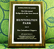 |
| Winner of the 2009 BASEBALLPARKS.COM Ballpark of the Year Read the press announcement here |
| Team: The Columbus Clippers of the Triple-A International League |
| First game: April 18, 2009, a 3-1 win by Toledo over the Clippers |
| Capacity: 10,100, of which 8,800 are fixed seats |
| Architect: 360 Architecture |
| Construction: Turner |
| Price: $42 million for the actual construction |
| Home dugout: First base side |
| Field points: Southeast |
| Playing surface: Kentucky bluegrass grown at Tuckahoe Turf Farms in NJ |
| Betcha didn’t know: The park sits on the edge of the Arena District, which for 150 years was the site of the Ohio State Penitentiary. |
Exactly. You’d think that every design innovation that could be worked into a baseball stadium had already been done. Visit Columbus, Ohio’s new Huntington Park, and you’ll learn that there are new things under the sun. And the ideas aren’t just different. They are ideas that work beautifully.
And seeing different design approaches is what makes visiting new ballparks fun. After all of the duplication of the same basic layout for Minor League parks in the past 15 years, it’s a pleasure to see new ideas — and Huntington Park has more than its fair share. All the better for baseball fans in Ohio.
And that’s why this unique stadium has been named our BASEBALLPARKS.COM Ballpark of the Year.
I attended the second game at the park, as the parade and grand-opening had occurred the day before. The fans of Columbus were still buzzing, though, about this incredible facility that had landed near their downtown. They were making their way up to Roosters restaurant and, believe it or not, the bleachers on the roof level of the separate building that overlooks left field. They were taking pictures from the Home Run Porch that overlooks right field. They were sampling the wonderful food from local restaurants like City Barbeque and Donatos Pizza.
And almost all of them were repeating the oft-said phrase at a new park: “There’s not a bad seat in the house.”
One of the amazing aspects of this park is how little tax money was spent on it. “This is a private-sector development, not one done by the city,” Ralston said. “Except for some state money from their Cultural Arts Facility funds, zero public funds were spent.”
Where did the money come from? Private firms, who then have the right to advertise within the park. Ralston told me that the biggest contributor was Huntington Bank at $12 million. Of course, they also received the naming rights on the park for this. Nationwide and the Columbus Dispatch had the next highest contributions at $5 million apiece.
So what makes this facility so incredible and so innovative? Its location? Its stunning exterior? The main seating bowl? The concession stands — both in how they’re designed and what they serve? The thoughtful extra touches?
Yes, yes, yes, yes and yes.
So let’s examine the park’s interesting setting in Columbus’ Arena District, its fabulous exterior (some of the best parts of which most fans will never see), the innovative interior design and the incredible experience of attending a Clippers game. You’ll see why it won our 10th annual Ballpark of the Year award, even though much more expensive parks like Yankee Stadium and Citi Field were also in the running.
The Setting
Just as the Clippers’ old park, Cooper Stadium, had aged less than gracefully, its neighborhood southwest of downtown hadn’t kept up with Columbus’ rise as a cosmopolitan city. When sentiment grew for a brand-new stadium, most local fans didn’t complain when other areas of the city were mentioned as possible sites. And in the end, the absolute perfect spot was located.
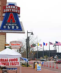
In the late ’90s , the city had established a 75-acre “Arena District” just to the northwest of the downtown financial district and less than a mile from the Ohio State Capitol. It was the city’s attempt to draw a big-league sports franchise, as well as make use of the land on which a decaying, abandoned penitentiary stood. The city worked with Nationwide Realty Investors, an arm of the insurance giant headquartered in Ohio’s capital city, on a big-time facility, which was designed by Heinlein Schrock Stearns, which today is known as 360 Architecture. Nationwide Arena opened in 2000 and is the home to a big-league tenant, the NHL’s Blue Jackets. Nationwide was also behind the development surrounding the arena, including beautiful condos, over a dozen restaurants, a grassy plaza, a theater, an athletic club (below left, with the new ballpark shown in the distance), a concert pavilion and lots of Class A office space.
 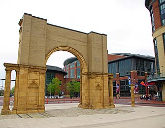 |
One particularly attractive facet of the area is that the historic arch at the city’s Union Station was moved to the Arena District. The shot above on the right shows the back of the arch, with Nationwide Arena beyond.
But a fairly unattractive parcel of land — a block from this arch — existed across Neil Avenue from the arena’s parking lots (below left, in 2007). Today, that block is the site of Huntington Park. The shot on the right below shows the finished park with Nationwide Arena in the background.
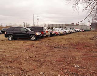 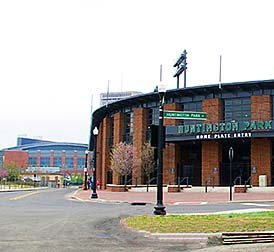 |
So the positives to the site of the park are these: a sense of history (for 150 years, this was the neighborhood of the state pen); plenty of parking by the arena and a nearby parking garage; easy access to highways and, very importantly, lots of nightlife nearby. The only downside is that the gorgeous exterior of the park behind home plate won’t be seen by many fans. More on that below.
The Exterior
So what about the exterior of Huntington Park? It’s fabulous, and has several aspects that are fairly novel.
Let’s make a 360-degree trip around the outside of the beautiful brick ballpark.
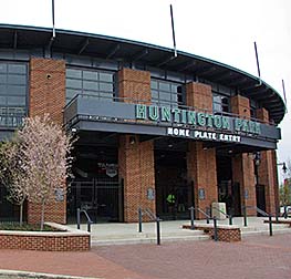 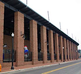 |
The entryway directly behind home plate is beautiful. It has a classic, almost Ebbets Field look (above left). There’s only one problem: most Clipper fans will never see it.
That’s because, in a way, the ballpark is built backwards. The ticket windows and main entry plaza are in center field. Almost all of the parking is across Neil Avenue from the outfield of the park, or a block down on Neil in a parking garage. There is a small lot near the home-plate entry, but it is for media, staff and some season-ticket holders. That means that most fans will never enter the park through these gates, and won’t see how beautiful the infield side of the park is.
That’s OK, because the rest of the exterior is special, too. And don’t misunderstand me: I don’t think the park should have been designed with the home-plate side nearer the parking. The way it was done was clearly the logical way, because of the angle of the setting sun, plus the view from within the park shows the skyline of downtown Columbus. And the entry plaza in center field is quite nicely done. It’s just unusual — but not without precedent (Atlanta, Indianapolis, Lehigh Valley) — that the main entryway isn’t somewhere in the infield.
As you travel down the third-base side of the exterior from the home-plate entry, you notice how attractive the brick columns are (above right). It’s also a nice look when you are inside the park, walking down that concourse.
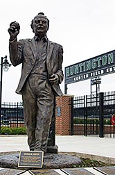 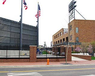 |
While there are gates near the left-field foul pole, it’s the ones in center field (both shots above) that will be used the most often. This is where the ticket windows are, and a lovely, raised entry plaza, colorful with blooming dogwoods. You’re even greeted by a life-size statue of Harold Cooper, namesake of the team’s former park. The plaque dubs him the “Patriarch of Columbus Baseball.”
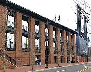 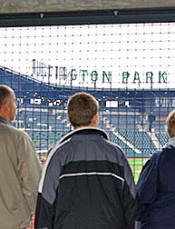 |
The right-field side of the exterior (above left) has some fascinating design elements. Not only does the back side of the scoreboard carry a billboard-size welcome to the park, the right-field fence is only a few feet away from Nationwide Boulevard. The designers took advantage of this to create five “windows” through which fans without tickets can peer into the game, a la AT&T Park in San Francisco.
While the first-base exterior is less remarkable than the other three sides of the square-ish structure, it still offers the brick columns of the third-base side, as well as a small parking lot and team offices.
All in all, one of the nicest ballpark exteriors I’ve seen in awhile.
The Design
The interior of Huntington Park is even more stunning than the outside. Here you will find one innovative design element after another, after another, after another.
Let’s start with the best one of them all: the main seating bowl. If you’ve been to a lot of Minor League parks, especially those of a recent vintage, you’ve seen an open concourse behind home plate. Almost without exception.
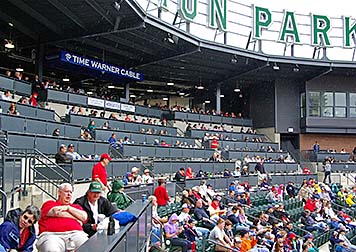 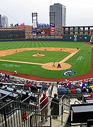 |
Not here. In fact, the seating behind the backstop goes all the way to the front edge of the upper level. The regular seats closest to the field are called Club Seats — and I do mean close, as the first row is only 48 feet from the plate. The rows behind the Club section are in the Loge (above left). The Loge is actually made up of counter tops and moveable chairs, with easy access to the upper-level lounge right behind you. This is truly a great concept in stadium design, and gives you a great view of the action (above right).
In order for this seating section to work, it must have a fairly steep incline. In fact, the entire lower seating bowl is a little steeper than at other parks. Not only does this keep the fans closer to the action, it also permits the luxury boxes on the upper level to be closer to the field.
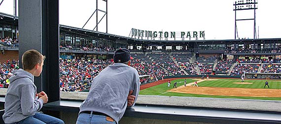
Down the right field line is the Home Run Porch, complete with two levels for standing and watching the action from a great vantage point (below). The traffic isn’t very heavy here because fans can’t walk from here around to left field. Once you reach a stairwell right next to the scoreboard, that’s the end of the road. Indeed, this is the only one of the three new Triple-A parks opening this year that doesn’t have a 360-degree concourse.
 |
“It was a healthy debate” over whether to have a concourse all the way around the park, said 360 Architecture’s Ralston. In the end, the design group elected to think long-term rather than short. “Once a park matures, the novelty of walking all the way around will pass and you’ll just want to go back to the spot in the park where you’re most comfortable watching the game.” Further, Nationwide Boulevard on the park’s south perimeter doesn’t run perfectly parallel to Harold M. Cooper Lane on the north side. This forces the park’s footprint to be a little more narrow north-to-south on the eastern (left-field) side than on the western edge, and presses the street right up against right-center field. The result? The concourse stops when it reaches the scoreboard.
Now, in my opinion they still could’ve inserted a walkway — admittedly, it wouldn’t have been very wide — underneath the scoreboard to connect the right-field and center-field areas. A 360-degree concourse is one of my favorite ballpark features, and without one, the wonderful right-field Home Run Porch tends to feel a little remote.
The things you’ll find on the other side of the scoreboard, though, are phenomenal, starting with the batter’s eye just to the left of the scoreboard. This isn’t your grandfather’s batter’s eye, though. The design team wanted something special, and that’s what they created. “One of the most interesting challenges in designing a park is how to make the batter’s eye,” said King of 360 Architecture. “There isn’t a catalog for those.”
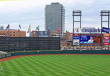 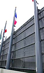 |
The one in Columbus is like none other because a series of flag poles and pulleys (above right) allow its fabric to be lowered all the way to the ground when there’s not a game going on — and it can be removed entirely for storage at the end of the season. That way, the public can look in and see what a lovely park exists beyond that batter’s eye. Truly, in a park full of innovations, this one is near the top. Sports Business Journal, in fact, found it so novel they devoted an entire article to it.
The area around the center-field concourse is alive with activity. “Other parks have a number of their features behind home plate, and out in the outfield, there might not be a lot” explained Ralston. “Here, we thought we’d reverse that. We wanted to make a midway experience that you encounter first when you enter (the center-field gates).”
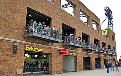 |
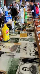
One intriguing design decision in this area was to construct a completely separate building beyond the left-field concourse (above). While its name isn’t very imaginative — the Left Field Building — its exterior is. That’s because a slightly different color of brick was used here to make it appear much older than the ballpark itself. And like its bigger brother in Baltimore, this warehouse-looking structure is abuzz with activity. The ground level features a Bob Evans concession stand, the souvenir shop, restrooms and the ticket windows. The second floor has the Hall Of Fame Bar with six balconies from which to watch the action on the field and fascinating memorabilia everywhere, much of it embedded in the bar itself (below left).
 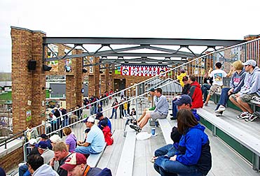 |
The top level (above right) is the most fascinating, though. Here, you’ll find Roosters, a restaurant and bar, as well as Wrigley-esque rooftop bleachers. And the most interesting thing about this level? There’s no roof over it!
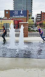
The only berm in the park in is left center field. No, it’s not as large as at other new parks, but it does offer fans a perfect, unobstructed view of the field, unlike Gwinnett County’s new Triple-A park. Behind the berm on the street side of the batter’s eye is a clever idea — a fountain (below center). It’s not a Kauffman Stadium-type of showy, colorful, shooting-water fountain. Instead, it exists so that kids can cool off by splashing around and running through it. An absolutely great idea.
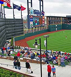  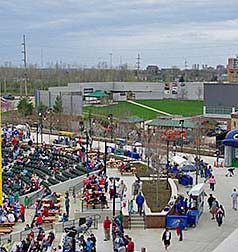 |
The concourse level in left field (above right), called The Grove because of its wonderful landscaping, is an example of the “neighborhood” concept the designers were trying to achieve. This is a very family-friendly place, with an inflatable game for the kids, picnic tables and concession kiosks like the Catcher’s Mitt Grill with cheeseburgers and Cracker Jacks. If you look carefully at the right-hand shot above, you’ll notice a grassy area toward the top of the picture. This is an outdoor concert pavilion across the street from the park. One more reason the site for the ballpark is excellent.
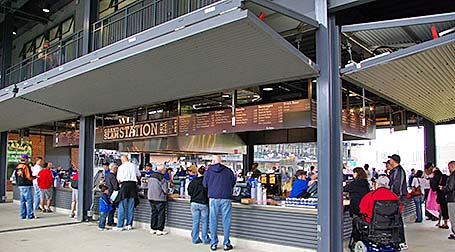
Finally, one of the most clever features of Huntington Park is the design of the concession stands behind both first base (below) and third base. Here, you can face the field while ordering because the stands are open on all sides. Ralston revealed that, “We asked ourselves, ‘How do we make it (a concession stand) open and inviting?’ We decided that we hate backing the stands up against a wall, so we made them open and airy.” There’s also a bar using this design in the lounge above home plate.
 |
Yes, there’s quite a lot to say about the brilliant design work done by 360 Architecture and their design partners. Bravo!