Back to page 1
The Exterior
With a move back to Birmingham, the new ballpark needed to look like it belongs in Birmingham. In that category, Regions Field passes with flying colors.
The Barons’ new home “fits incredibly well into Birmingham,” Henning said. “You couldn’t just pick it up and drop it in another city. There’s nothing that HKS believes in more strongly. If you’re going to spend the dollars, then build something that is unique. Build something so the city feels it is its own.”
The process of designing the ballpark’s exterior began with research. “Over a series of planning meetings, we looked at the architectural history of Birmingham,” recalls Chambers. “It’s a city with a great industrial heritage, very well-known for steel making. We toured Sloss Furnaces (a former iron mill that is now a National Historic Landmark), and noticed a typical roof shape. This roof shape became the iconic look of the ballpark.” Indeed, if you examine the photo of the Sloss shed (below left), you’ll see an extension of the roof at its peak. That roof was emulated in the structure on the first-base side of Regions Field (below right).
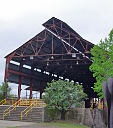 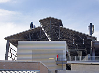 |
| On the left is a “shed” at the Sloss Furnaces, now a National Historic Landmark, in Birmingham. On the right is the southern end of the structure that acts as a roof over the suites on the first-base side of the ballpark. |
If you’re enjoying the outdoors at Railroad Park, then the aspect of Regions Field that you will primarily notice is the lovely brickwork all along the third-base side of the exterior — complete with an oldstyle “B” on the brick. This masonry is also the result of research by HKS, as it is meant to resemble the downtown buildings of Birmingham. Well, maybe “resemble” isn’t the right word, because an enormous amount of trouble went into having just the right “blend” of brick colors. The brick blend has “a slight variation of color throughout the blend,” revealed Kevin Suter, Senior Designer at HKS. “The firing process on this blend is what results in portions of some bricks containing … blue-gray coloration. The selection of this brick blend with its variation was intentional as it does relate to the historic buildings downtown in addition to picking up on the overall color palette of Regions Field.”
“The brickwork and roof lines are more of a fit in Birmingham,” concluded Crenshaw. “Frankly, this place is jaw-dropping.”
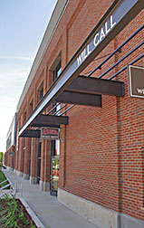 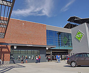 |
| The masonry on the side of the ballpark that faces Railroad Park is gorgeous. On the right is the Serra Kia Auto Plaza. Here are ticket windows and the main entryway into Regions Field. |
There are three main entry gates in the ballpark. The one on the south side of the facility on Third Avenue South wasn’t completed when the park opened, but there is one across the street from Railroad Park along First Avenue South. The main entry gates are on the Serra Kia Auto Plaza behind home plate. This is an attractive meeting spot.
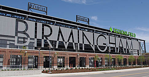
Clearly, though, the most impressive aspect of the park’s exterior is the iconic BIRMINGHAM sign on the first-base side, along 14th Street South. Visible from I-65 about four blocks away, this is perhaps the defining element of the park (photo below).
It’s not really a sign, though. The letters that spell out “Birmingham” are a very clever mixture of different shapes and textures of the metal panel of the park’s exterior. This is truly a unique ballpark feature, one that needs to be visited and photographed when you attend a Barons game.
While the effect that produces the ten letters works beautifully during the day — especially in the afternoon sun — it’s almost invisible at night. This is a real shame, although the architects realized this would be the case. They had intended for a series of LED lights to illuminate the letters in “an array of colors and patterns,” according to Henning. Unfortunately, the $75,000 that it was going to cost wasn’t in the City’s budget, so the letters remain dark in the evening. I really hope the lights are added in any “phase 2” upgrades to the park.
 |
Now let’s look inside the new ballpark.
The Design
Both figuratively and literally, the exterior of Regions Field says “Birmingham.” But how does the interior measure up?
Quite well, actually.
The metal-panel siding found in the non-brick, non-glass portions of the exterior also finds its way into the interior. This establishes the industrial look on the inside of the park as well as the outside.
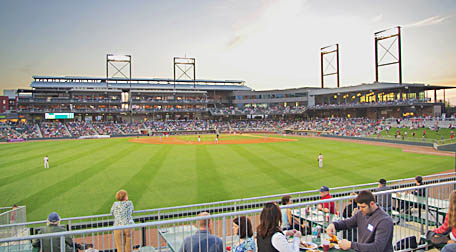 |
| When you view the ballpark from the outfield, its asymmetrical layout is easy to see. |
If you’ve visited very many Minor League parks, the aspect of Regions Field that will blow you away is the way its asymmetry is achieved. First, the luxury suites aren’t equally distributed on both sides of the plate the way they are at almost every other ballpark in the land. No, all 23 of the private suites (plus two party suites) are on the first-base side of the diamond in an arrangement the designers from HKS call “double stacking.”
This means that there are essentially three levels in this structure, with the ground level having concessions, rest rooms and 25-person Concourse Suites at the rear of the main seating bowl, then Level 2 and Level 3 suites on top of that. Because the suites are constructed directly above the concourse in a vertical style akin to a high-rise apartment building, the seats at the front of the suites are incredibly close to the action. The perspective of the field is as good as I’ve ever seen from a suite in a ballpark.
Because there are three levels, the first-base side of the park is taller than the third-base side (which has only two levels), heightening the sense of asymmetry. Also, the suites run in a straight line, very similar to the suites that are built into an old railroad shed at Montgomery Riverwalk Stadium, another Southern League ballpark in the Yellowhammer State. That straight-line approach allows the overall structure on the first-base side of Regions Field to have the proper look of a long, straight steel-mill shed, complete with the iconic extension on the peak of the roof. This completes the “industrial” look perfectly.
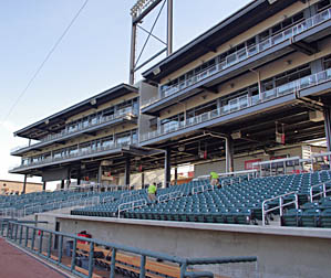 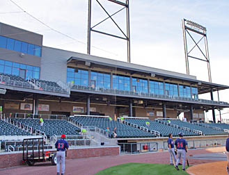 |
| From down on the field prior to the game, you can see “double stacked” suites on the first-base side on the left and some of the Club seats and the windows of the banquet hall on the right. |
Behind home plate and on the third-base side, the upper level contains Club seats and the lounge that those seat-holders can access … and a banquet room. This isn’t just any banquet room, either. It is both massive and stunning, providing 15-foot-tall windows on three-sides of the 6,500-square-foot room. From within this room, you can view the action on the field on one side, the skyline of downtown Birmingham on another, and the expanse of Railroad Park (complete with trains and the sunset beyond) on the third side.
When I asked HKS’ Byron Chambers to name his favorite aspect of Regions Field, he replied “I’m most pleased with the fact that the facility has a sense of grandeur that you don’t often see in a Minor League ballpark. A lot of that has to do with the scale of the park. When you’re out in left field (looking at the park as a whole), you feel like this is more than a Double-A ballpark. It feels complete.” Indeed, and this banquet hall has a lot to do with that. Other Minor League parks have meeting rooms and banquet facilities, but none rival this one. In fact, it is almost the equal of the spectacular dining room on the second level of Target Field in Minnesota, with its own 270-degree view of the field and Minneapolis skyline.
“Getting groups to rent our banquet facility in Hoover was a challenge,” noted Nelson, the Barons’ GM. “Here, we offer a great facility with incredible views. (Hall rentals) are going to be a big part of our business success.”
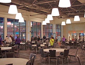 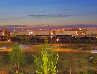 |
| The Barons now have the best banquet facility at any Minor League park in the country. On the right is the twilight view through the windows on the north side of the banquet hall. In the foreground is Railroad Park, as a train is whizzing by. |
The importance of the asymmetrical design of Regions Field can’t be overstated, as there are several reasons for it. First, it adds to the “industrial” look of the facility. Second, “we took advantage of the views afforded by the park’s location,” said Chambers. By eliminating any upper levels down the third-base line, the skyline of Birmingham is visible to those sitting down the first-base line. Also, those on the third-base side can see the medical centers and Red Mountain.
Third, and very importantly, “we gave a nod to Rickwood Field, which is very asymmetrical,” Chambers explained. Rickwood, dubbed American’s Oldest Ballpark, is only three miles due west from Regions Field, and it is beautifully and lovingly maintained by a non-profit organization called Friends of Rickwood. This was the home of pro baseball — both for the White Minor Leagues and the Negro League Black Barons — in Birmingham for decades. If you ever come to the Magic City, you simply must visit this ballpark (also see our photo essay on the Rickwood Classic in 2010 when the park’s 100th birthday was being celebrated). You will notice that the grandstand on the third-base side ends just beyond the infield, while the first-base stands wrap around the right-field foul pole. This is also the arrangement of the seats at Regions Field.
The seating bowl isn’t the only element borrowed from Rickwood. “When designing the light towers at Regions Field, we were certainly aware of the presence the Rickwood light towers have within that park,” said HKS’ Suter. Like at Rickwood, the towers holding the lights are an extension of the stadium’s structure, not separate towers like at many parks. Also, there is “cross bracing” in the shape of an “X” on the supports, meaning the towers will cast shadows onto the field in a shape similar to the shadows at Rickwood.
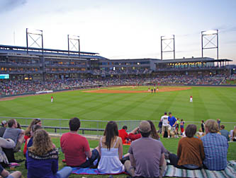 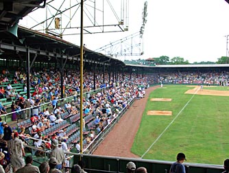 |
| Both Regions Field and Rickwood Field have asymmetrical seating bowls. The shot on the right was taken at the Rickwood Classic in 2010. The fact that Rickwood’s grandstand stopped just beyond the third-base dugout and wrapped around the right-field foul pole heavily influenced the way the seats were arranged at Regions Field. |
Thankfully, the main concourse runs a full 360-degrees around the field, and it is “open” toward the action. The overall layout of Regions Field allows space in the outfield for family features. Down the left-field line is an area with inflatable attractions for the younger set. Near the foul pole is a berm, and beyond it is a picnic area that can accommodate large groups. There are more berms on each side of the batter’s eye (which itself will one day feature historical information about baseball in the area). Beyond those berms will be a wiffle-ball field, a concession area featuring Dreamland BBQ (hands-down the most famous BBQ in the city) and a beer garden. Beyond bleachers in right field will be batting cages that are used by the players before games, and that fans can try out while the game is going on.
In an attempt to keep things interesting, the field dimensions received some extra scrutiny. “We spoke with the Barons and the White Sox (Major League parent of the Barons) about this,” said Chambers. “We wanted the balls to play differently with different wall heights and angles” in the outfield. The result is a 12-foot-tall wall in left field, which is 320 feet from home down the line, and 380 feet to the power alley. It’s 325 feet down the line in right field, and 375 to right center. The wall is also 12-feet tall in right, but only eight feet tall from right center around to left center, allowing outfielders to snag fly balls that are just above the fence. It’s 400 feet to dead center.
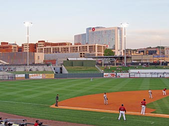 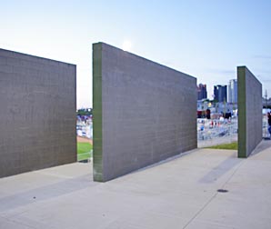 |
| While not approaching the category of “quirky,” there are some angles in the outfield fence that will provide challenges for fielders. The medical district can be seen in the background, with the tallest building being the Children’s Hospital. On the right is the only three-part batter’s eye I’ve ever seen. At some point the back side of these three slabs will be covered with images from Birmingham’s baseball past. |
While it might seem that every inch of Regions Field’s footprint was designed with a specific activity in mind, that’s not actually the case. “We intentionally designed places for fans to stand and watch the game,” Chambers explained. “That was very important to us.”
All in all, the design of Regions Field’s interior is remarkable, both from an architectural point of view as well as making things fun and convenient for the fans. Let’s now take a look at what it’s like to attend a game at this impressive new facility.