Article and all photos by Joe Mock, BaseballParks.com
All rights reserved
 |
About once a year, I stop in Visalia, CA to check out Recreation Park. There’s nothing else like it in pro-baseball, because I don’t think it’s possible for a fan to sit any closer to the field of play. Anyway, there had been a flurry of activity in recent years regarding significant improvements to the aging facility, and I like to keep track of the progress being made there.
But when I drove up North Giddings Street in June of 2009 to see what was new at the old ballpark, a huge brick structure sprung from the horizon in front of me, immediately causing me to think I’d turned down the wrong street.
Nope, it was the right place. But, boy, it was not the same ol’ ballyard!
Following $11.6 million in extreme makeovers, the place has been transformed. Keep reading to see exactly what has changed, and what impact those changes have on attending a game at Recreation Ballpark.
 |
First, let’s talk about branding — both for the team and the stadium. Visalia’s California League entry has had a variety of nicknames over the years, the most recent being the Oaks, from 1977 through 1992 and again from 1995 through 2008. Following a trend of switching names when there’s a ballpark change (such as the Fort Wayne Wizards becoming the TinCaps when they moved into new Parkview Field in 2009), the Oaks recreated themselves as the Rawhide as they prepared to play in their rebuilt park.
The name Rawhide lends itself to all kinds of cute Western labels to be applied to different aspects of the new facility, as we will see. The team also decided to dress up the name of the facility, going from Recreation Park to Recreation Ballpark, complete with a new logo just for the stadium. Tom Seidler, Rawhide President and GM, told me that a major reason behind the switch was “because we had confusion from the community on events held at the ballpark versus the surrounding city park,” which is also called Recreation Park.
So the team entered the 2009 campaign with a new team nickname, a new park name and a significantly upgraded ballpark. That’s a pretty nice trifecta.
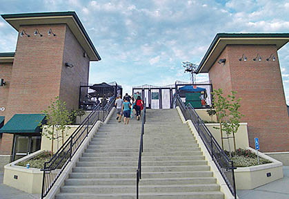
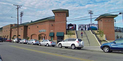
By the way, the image above is what you see as you drive up Giddings Street. To say that this is an incredible departure from the decidedly low-tech field-level bleachers that used to be here would be an understatement.
From this view, you see the impressive stairway that has become the entryway of choice for fans attending a game. On the street level are the ticket windows and the team offices (an exceedingly big improvement from before). On the upper level are the amenities that are accessed from the field side (below).
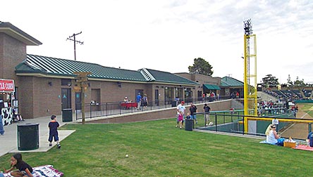 |
Here you can see the concourse and berm that was created by heaping tons of dirt into the tight space between the new structure and the field. And tight it was. Seidler told me that it is only 90 feet from the foul line to Giddings, and that lack of width dictated what they were able to do in designing the new facilities. I’d say they got it right.
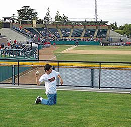 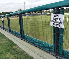 |
Even before you notice the impressive new amenities in the structure itself, you’ll be struck by the berm that was created in foul territory and beyond the right-field wall. Picking up on the Rawhide theme, the team calls this The Pasture. This badly needed space allows kids to run and play, and their families to plop down on a blanket nearby. Nearby is an open area for more kids’ adventures. Here — for some games — there are inflatable games and other activities for the younger set.
The team didn’t miss the opportunity to warn fans on The Pasture that “moooving” objects might arrive suddenly (above right). This is an appropriate warning, because spectators are extremely close to the action here.
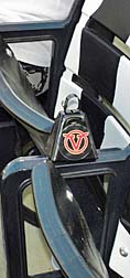 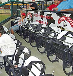 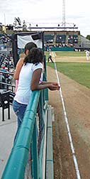 |
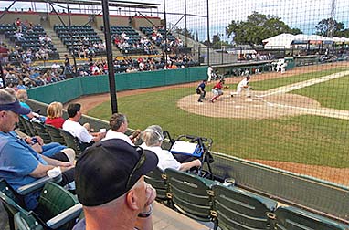
In fact, a new seating section called the Land O Lakes Cowbell seats is not only very, very close to the action, your $8 seat also comes with a cowbell (above left). To give you an idea of how close these seats are to the field, see the photo above on the right, which was taken directly behind the Cowbell section.
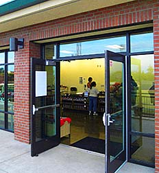 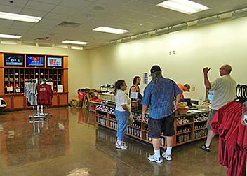 |
In the new structure itself are concession stands, restrooms, the cutely named General Store (note how the merchandise isn’t jammed into the space. There’s room to breathe here, unlike the tiny space they had before) and the most impressive element of them all (below).
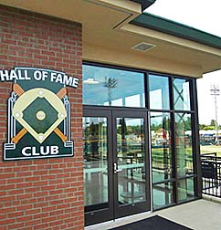 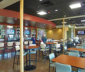 |
Adam Martin of the team’s front office was very helpful to me as I was getting acclimated to the surroundings at Recreation Ballpark. When I asked him what he thought was the most impressive part of the enhancements, he quickly replied the Hall Of Fame Club.
Indeed, this is a first-class lounge area, with gorgeous appointments and furnishings. There’s a full bar and a special meal selection for members (I was told it was linguini with shrimp that night I was there).
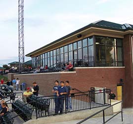 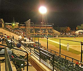 |
The exterior of the Club is very attractive (above left), and the seats directly in front of the lounge provide a great vantage point of the action (above right).
And in that shot, you can see the historic seating bowl behind the backstop. These seats are like none other in pro baseball, as their proximity to the playing field is, well, almost unsettling. You are so close to the action you feel like one of the players.
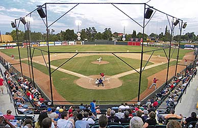  |
The aging bench seats in this area were replaced in 2002 (2009’s renovations weren’t the first here. Following the replacement of the benches with plastic theater-type seats came the rebuilding of group areas on the third-base side prior to the 2007 season). However, the location of the earthen and concrete mound on which the seats rest hasn’t budged an inch. That’s a good thing, because sitting here is a delight (above left). The grandstand seems to bend right around the catcher and umpire. Indeed, a wild pitch here doesn’t necessarily mean a baserunner will get to the next base safely.
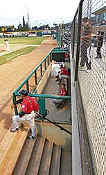
And the dugouts here are mostly underneath the walkway at the front of the seats (above right). Shades of Pawtucket!
Most grandstands are built with some sort of steel structure at its foundation, or else the seats rest in an excavated bowl so spectators can walk into the stadium at street level and then walk down to their seats. Not here. As the left-hand shot below (taken from the park’s small parking lot) shows, there is indeed a man-made mound on which the grandstand rests. Interestingly, the mound is made largely of dirt and rock that was excavated during the construction of nearby Highway 198 in the 1960s.
While this mound has done its job for decades, it put a damper on plans developed by the team a few years ago. Originally, the renovation plans — with a much more modest pricetag of around $6 million — called for the fancy new seating sections and pressbox to be built in the infield. Alas, after architectural renderings had been completed, an engineering survey revealed that the mound wouldn’t support such a structure, so that plan was scrapped. Visalia’s city council in April, 2007 stepped up to the plate (an appropriate baseball metaphor) and approved the $11-million project to construct what you see today.
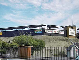 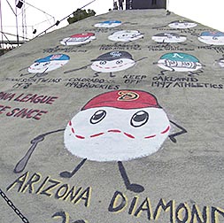 |
This meant that the significant new structure was constructed on the first-base side instead of behind home plate. It also meant that the mound supporting the seats in the infield is still there, too. In fact, the third-base side of the mound (above right) has been decorated by colorful baseballs with arms, legs and caps, painted there by Karla Thompson, who also happens to be a concessions vendor at the ballpark. If you look closely, you’ll see that the baseballs provide a history of the big-league franchises that have been affiliated with Visalia’s Cal League teams over the years. Just one more feature that makes Recreation Ballpark unique.
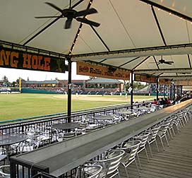
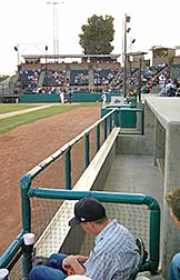
And while we’re examining the third-base side of the park, it’s important to note the major improvements that were made here following the 2006 season. There are now covered group areas, including the Watering Hole for larger groups, and a separate “fan dugout” (below right) that can be rented for an individual game.
  |
There is a lot to admire regarding Recreation Ballpark. First, you have to admire a community of this size (population 137,000) supporting Minor League baseball the way it has for so many decades. Second, you have to admire the front office of the team for its perseverance in pursuing improved facilities, and in coming up with such an interesting and functional design (hats off to Tom Larimer of San Diego’s Fehlman-LaBarre, who designed this project). And without a doubt, you have to admire Visalia’s city council for backing the renovations even when the pricetag almost doubled.
And what they got for their money is an incredibly impressive place, one that makes it hard to remember what was there before the first wave of renovations began in 2002 — back before the extreme makeover started.
 |